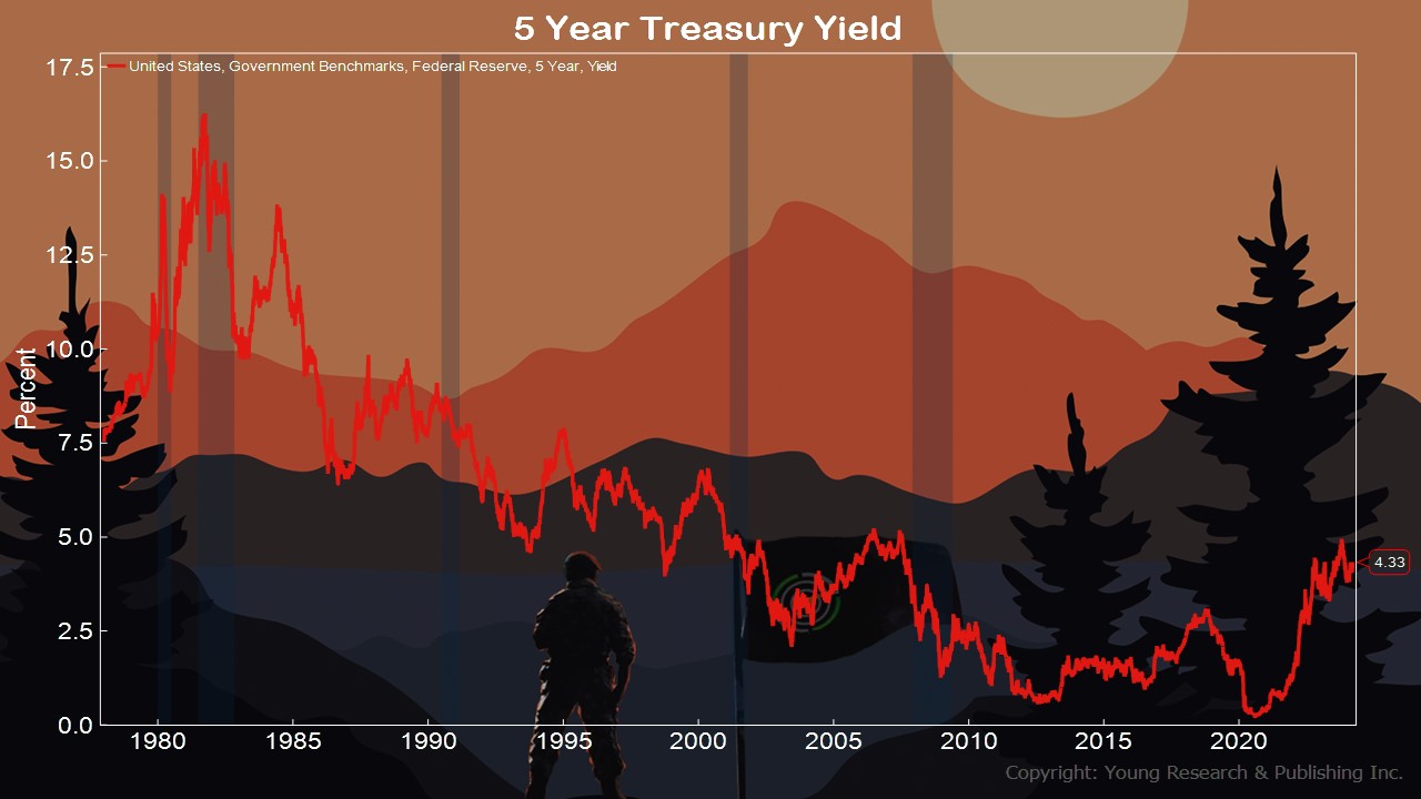
Run your finger along the 5-year treasury line in the chart above, and you immediately get a sense of where we’ve been.
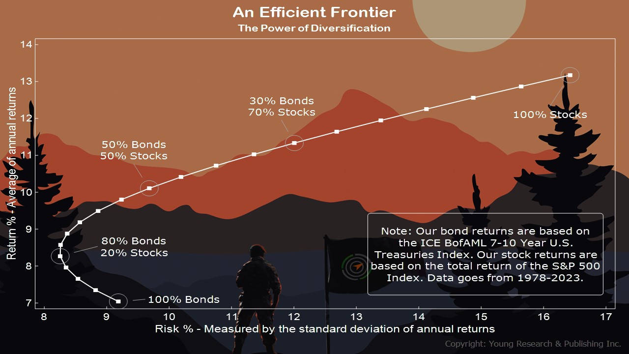
As you can see above falling interest rates were a boost to bonds and stocks. This efficient frontier is a combination of bond returns based on the ICE BofAML 7-10 Year U.S. Treasuries Index and stock returns based on the total return of the S&P 500 Index from 1978 to 2023.
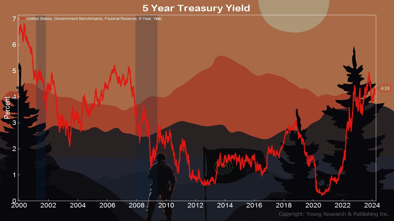
In the above, you’re looking at the 5-year treasury before the tech bust and then when it hit up to now.
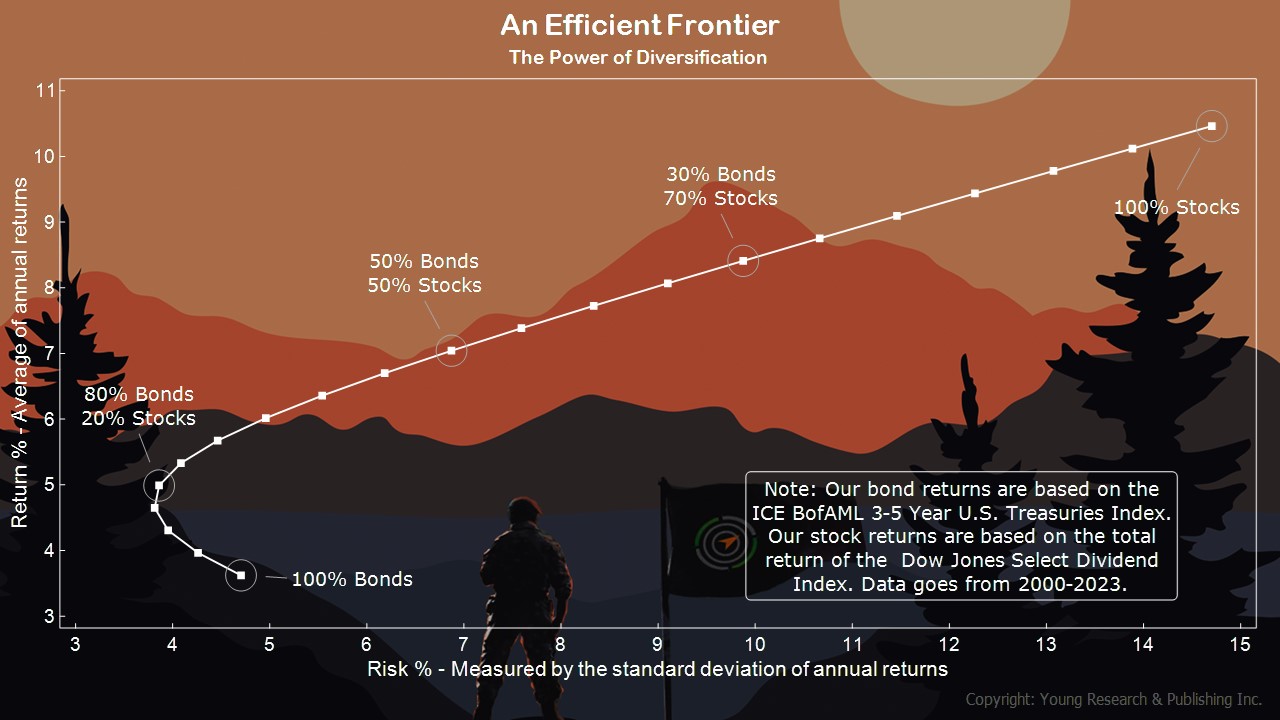
The efficient frontier above is from the same time period. This one contains bond returns based on the ICE BofAML 3-5 Year U.S. Treasuries Index and stock returns based on the total return of the Dow Jones Select Dividend Index from 2000 until 2023.
Takeaway: Notice how returns are affected between the two eras, but the risk/reward line still looks like a fishhook.
Action Line: Investor expectations do not match what the bond market is selling. Do not be a boiled frog lulled to sleep by this market. Now is the time to get your house in order. When you want help, let’s talk.
Originally posted on Your Survival Guy.
If you’re willing to fight for Main Street America, click here to sign up for the Richardcyoung.com free weekly email.


